
Project 03
Azren
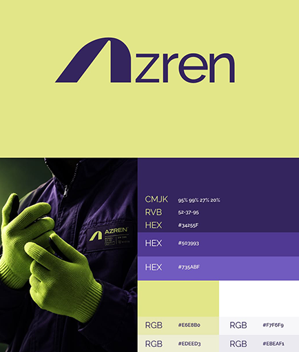
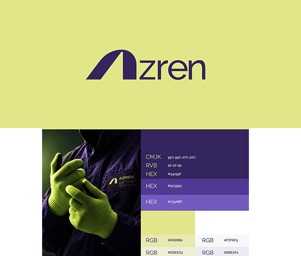
A full brand identity for Azren, a construction company. Built around a bold geometric monogram, a confidence-carrying purple and lime palette, and a disciplined visual system designed to hold up across workwear, site signage, and stationery.
-
Client - Azren, Construction
-
Date - 2024
-
Service - Brand Identity & Visual System
-
Industry - Construction
Problem
Azren needed an identity that looked credible on a construction site as much as it did on paper — a mark and palette that would read instantly on safety gear, site hoarding, and interior signage while still feeling professional and considered in client-facing collateral.
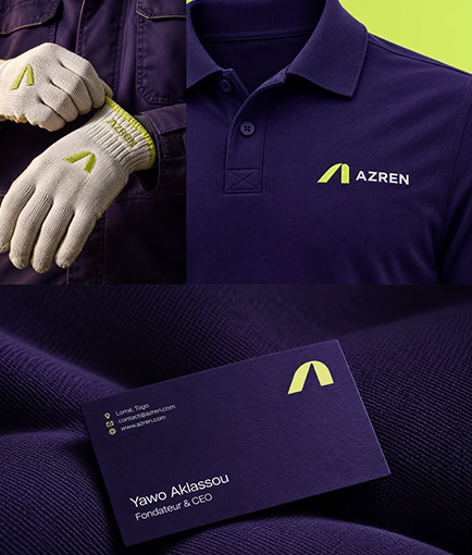
With applications ranging from PPE and workwear to building signage, wayfinding, and business cards, the challenge was to create a single system flexible enough to carry across every surface without losing its strength or becoming inconsistent.
Solution
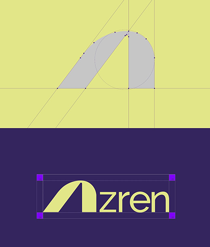
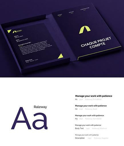
We designed a geometric "A" monogram paired with a disciplined purple-and-lime system, a clear typographic voice set in Railway, and a defined set of logo construction rules so the mark could be reproduced cleanly at any scale.
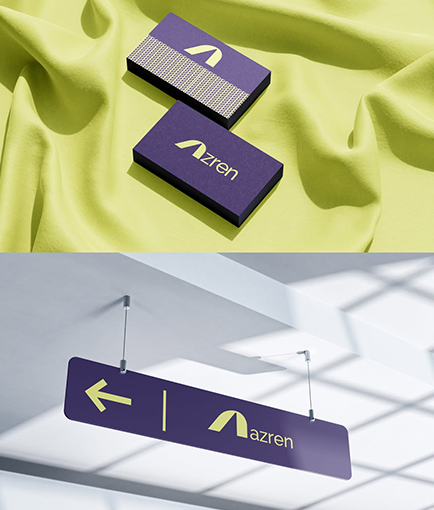
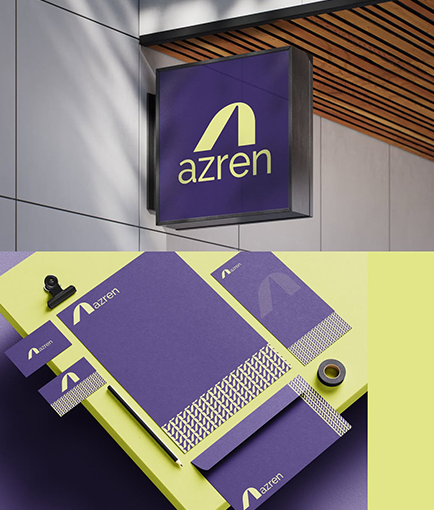
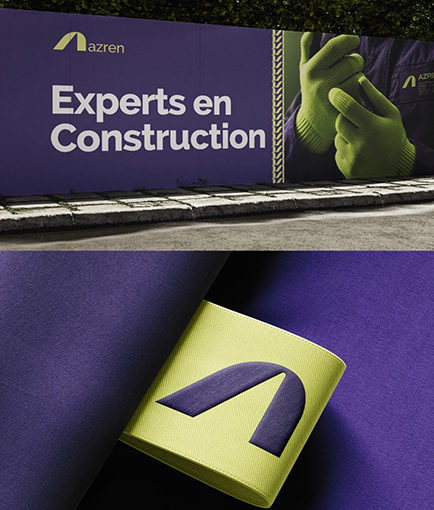
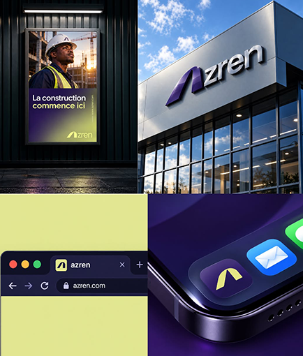
The identity extends across a complete application set — workwear and PPE, business cards, stationery, exterior and interior signage, and site hoarding ("Experts en Construction") — so the brand stays consistent from the site cabin to the head office.
The result is a confident, recognisable construction brand that feels equally at home on a hard hat, a hanging sign, or a website.